
Salient Bio

year
2026
timeframe
5 weeks
tools
Figma, FigJam, Canva
Overview
Salient Bio is a UK-based biotechnology company specialising in microbiome diagnostics and pathology services. We partnered with them to design an Education Hub for both patients and practitioners across existing and new user groups.
Problem Statement
Patients considering or using Salient Bio’s microbiome and pathology tests, and the clinicians who support them, lack a clear, centralised way to understand the purpose, process, results and next steps of testing. Because specialist diagnostics can feel technical, unfamiliar and difficult to interpret, users may struggle to judge whether testing is relevant, credible and useful at the point they need to make decisions.There is an opportunity to design an educational hub that supports confidence across the testing journey by giving patients accessible guidance and clinicians evidence-based resources to help them explain, recommend and interpret Salient Bio’s services.
00
sample size
5 competitors, 3 patients, 3 practitioners
Discovery Research
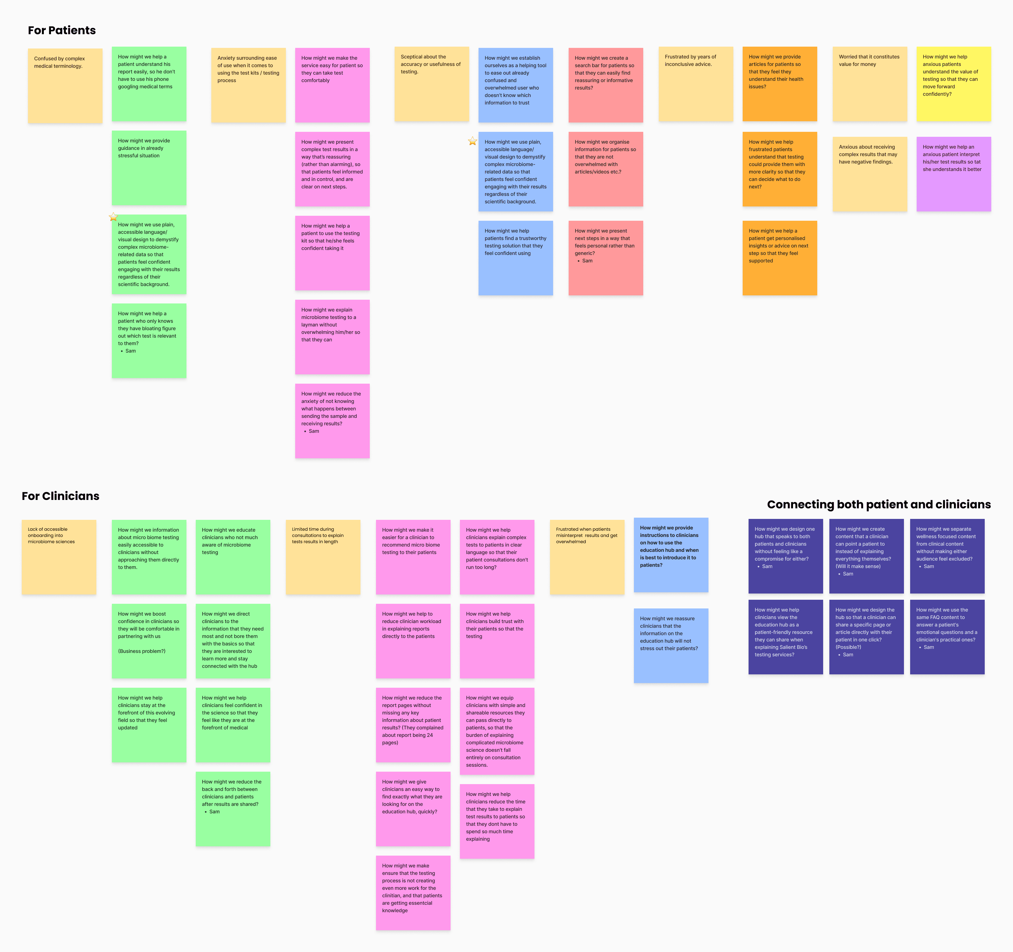
We conducted stakeholder interviews with Salient Bio alongside interviews with 3 patients and 3 healthcare practitioners to better understand user needs, workflows, and pain points. The findings were synthesised using affinity mapping and empathy mapping, helping us identify key themes and insights that informed the foundation of the design process.

01
Information Architecture
The sitemap translates our discovery findings and Salient Bio’s business goals into a clearer structure for the proposed education hub. Its purpose is to help patients understand the relevance, process, and meaning of testing, while giving clinicians enough context to explain reports, recommend testing, and guide next steps for their patients.

02
User flow

03
user testing method
In person moderated testing
sample size
7 patients and 3 practitioners
User Testing results
Sketches and low fidelity wireframes were then developed to Mid fidelity prototype. This was tested to see if users could find, understand and act on the information. Testing showed that users could often complete key tasks, but support needed to be strengthened around entry points, search clarity and key scientific terminology.

04
Style Guide
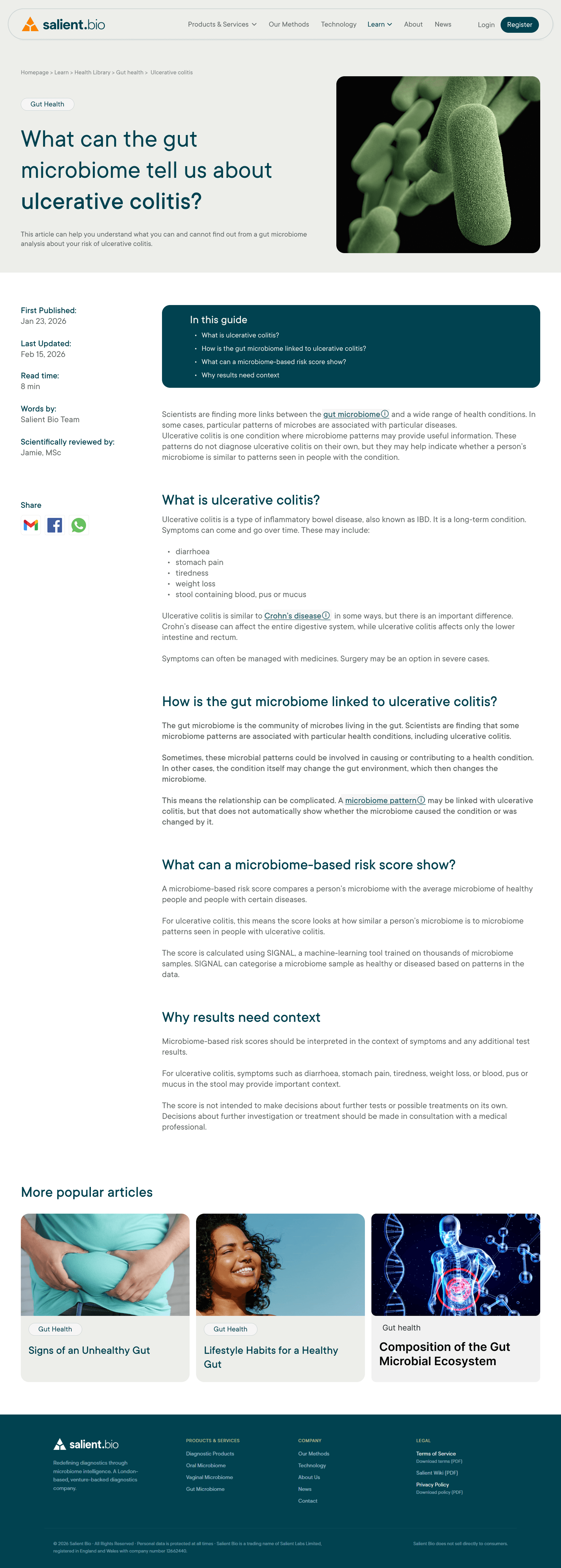
Once our mid fidelity prototype was tested and improvement made, we created a style guide to ensure visual consistency across the experience, defining typography, colour palettes, iconography, and component styles that reinforced clarity, trust, and Salient Bio’s scientific identity. We built on Salient Bio’s existing colour palette to maintain brand consistency, refining it by selecting the most accessible shades for use across the interface.

05
Hifidelity Design
I developed a high-fidelity design system and prototype that translated research insights into a cohesive visual experience. All app screens were designed with consistent typography, colour, and iconography — balancing a bold, energetic aesthetic with clarity and ease of use.
Interactive elements, including a points-based rewards system and activity tracking, make building healthy habits feel motivating rather than mundane. Gamification features such as daily goal tracking and redeemable points encourage momentum and sustained engagement. All components were built with consistent sizing, spacing, and alignment to deliver a polished, purposeful, and rewarding user experience.


Calendar screen gives users a historical view of their health activity — combining calendar visualisation with daily logs to track consistency and review past performance.
Calendar screen gives users a historical view of their health activity — combining calendar visualisation with daily logs to track consistency and review past performance.

Calendar screen gives users a historical view of their health activity — combining calendar visualisation with daily logs to track consistency and review past performance.


The Add/Log Meal screen offers multiple logging options, making it quick and easy for users to record meals. For the MVP, calorie intake logging is the focus.
06
client feedback
Following the presentation, the client expressed that they would like to see the new design implemented on their website as soon as possible, highlighting their confidence in the proposed direction
Conclusion
The next steps would be to validate the improved design and ensure the content remains safe, trustworthy, and scalable. This would involve testing whether the updated homepage, search experience, information architecture, and navigation improve user confidence and content findability. I would also evaluate clinician resources in more detail, establish clear guardrails for AI-generated summaries and health information, and develop a long-term content maintenance strategy to ensure the Learn Hub continues to provide a reliable and accessible educational experience.

.say hello