
Homelify
year
2023
timeframe
6+ weeks, 45+ screens
tools
Figma, Miro
Overview
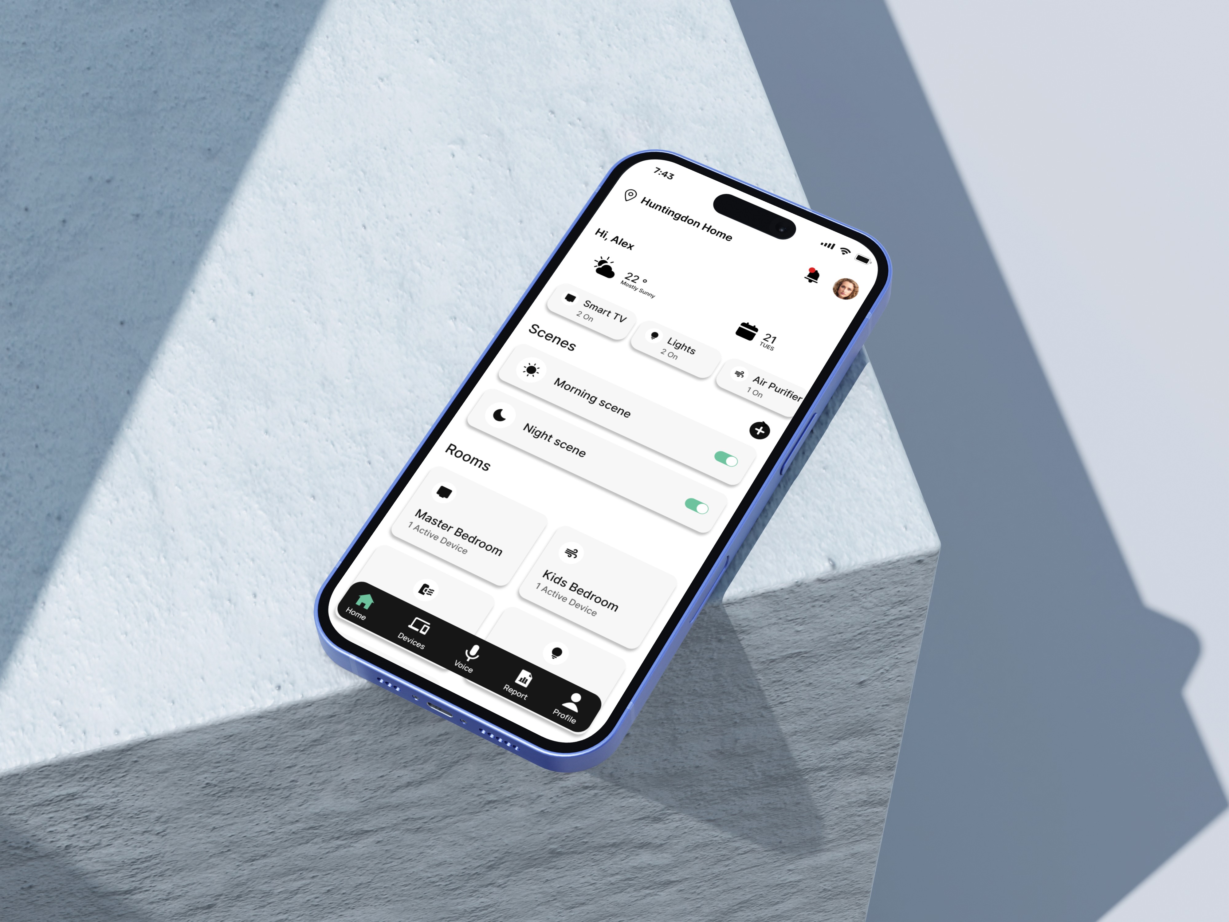
An innovative app tailored for homeowners and architects seeking a centralized solution for managing and automating IoT devices within smart homes. The primary goal is to create a visually appealing, intuitive, and responsive interface that enhances user experience and seamlessly integrates control and monitoring functions for various smart home devices.
Problem
Interoperability Challenges: Difficulty in connecting devices from different brands.
Accessibility for All Users: Accessibility challenges for certain user groups.
Energy Waste and Inefficiencies: Excessive energy usage and inefficiencies.
00
Competitive analysis
Our initial goal was to understand the exiting website’s functionalities, overall architecture, and navigation flow. This analysis helped us identify several usability issues and pain points, which we documented to validate later through user research.

01
research methods
Google Survey
sample size
30
Quantitative Analysis
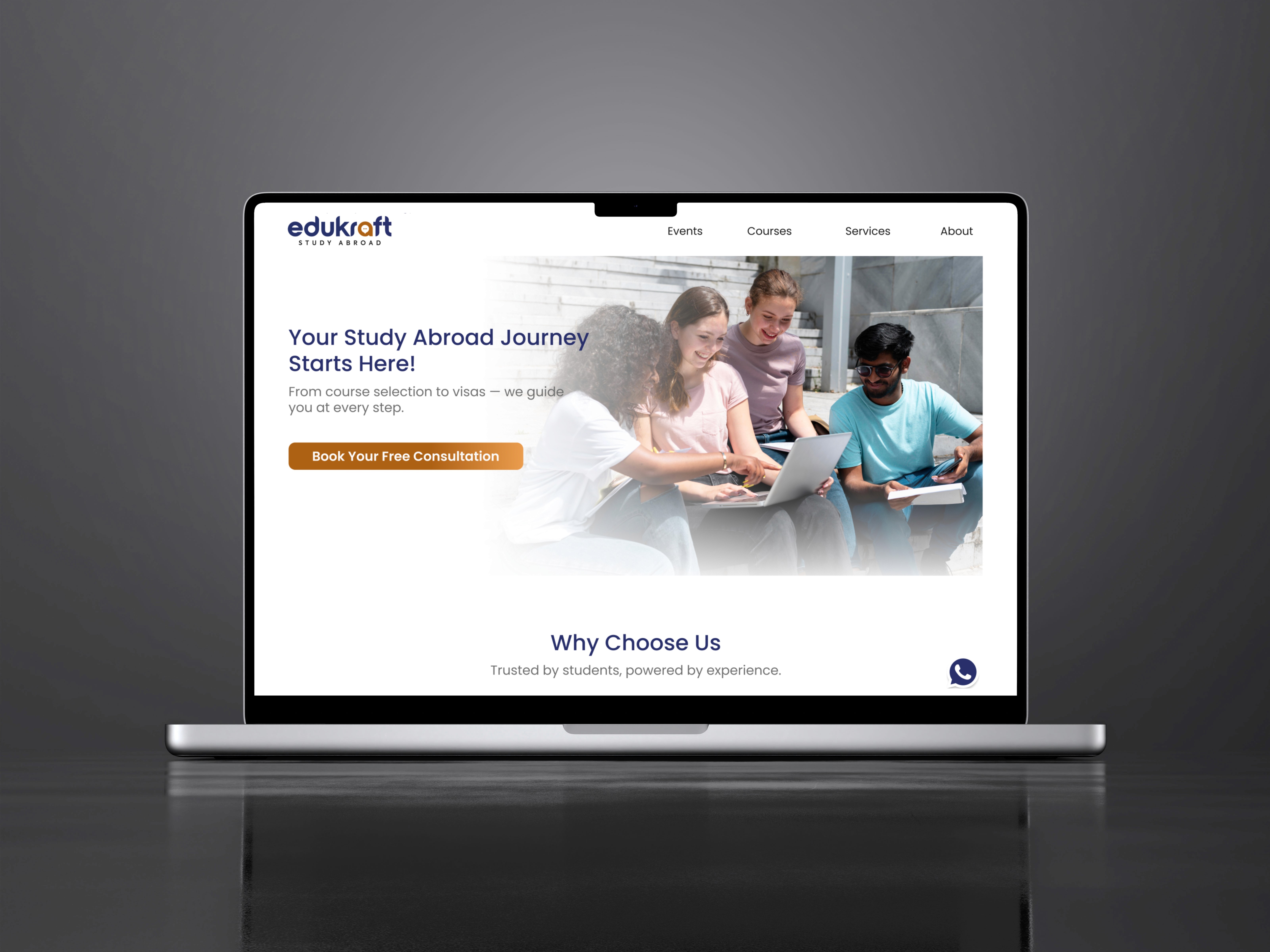
After analysing the UX issues on the Edukraft website, we conducted secondary research to gain a deeper understanding of the problems. Google Forms were used to gather feedback through warm-up surveys, identifying what works well on the current site and what needs improvement.

02
Competitive analysis
Our initial goal was to understand the exiting website’s functionalities, overall architecture, and navigation flow. This analysis helped us identify several usability issues and pain points, which we documented to validate later through user research.

03
Site Map

04
Low fidelity sketches

05

08

07

08

09

10
outcome
A unified system that gives every user — admin or guest — exactly the right level of control, with energy awareness built in.
Conclusion
This project explored the end-to-end experience of a smart home management app — balancing the needs of two distinct user types (admin and guest) within a single system. The key design challenge was making complex device and access management feel intuitive without oversimplifying the control hierarchy. Structuring the app around rooms as the primary mental model — rather than devices — reduced cognitive load and made navigation feel familiar to users regardless of their technical comfort level.


.say hello