
Edukraft
year
2025
timeframe
5 months
tools
Figma, Miro
Problem
Edukraft’s platform had scattered content aimed at guiding students but lacked clear organization, making it cluttered and repetitive with no clear user journey. The design also lacked in maintaining brand consistency
Overview
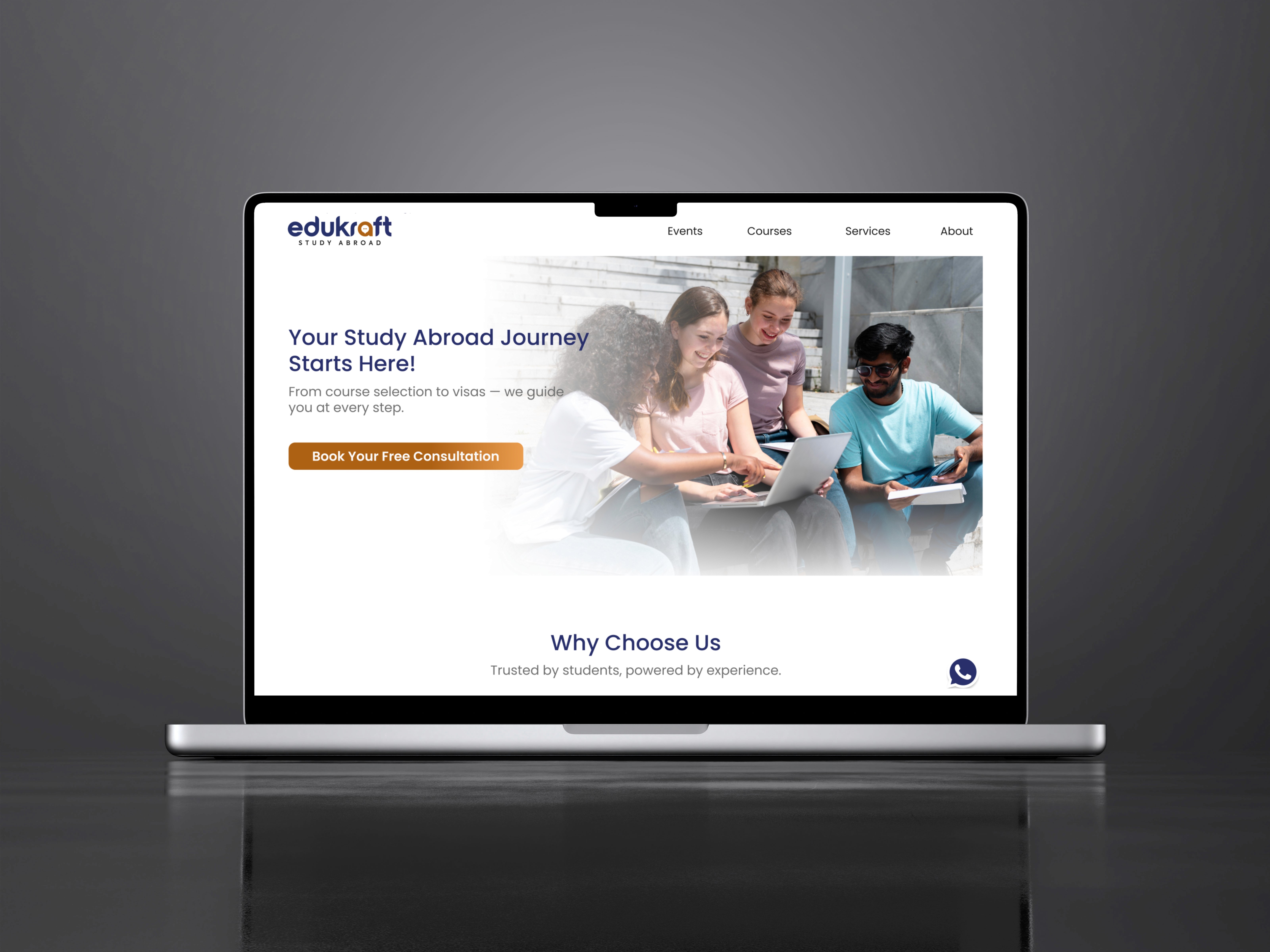
EduKraft is a leading overseas education consultancy that provides personalized guidance to students aspiring to pursue higher education abroad. We led the redesign of their platform, enhancing the way educational resources and course information are structured and presented to improve the student experience.
00
Review of existing website
Our initial goal was to understand the exiting website’s functionalities, overall architecture, and navigation flow. This analysis helped us identify several usability issues and pain points, which we documented to validate later through user research.

Cluttered Information: Excessive content makes it difficult to scan and grasp the key message.
Excessive Colours: Overuse of colours creates visual confusion, reduces readability, and distracts focus.
Lack of Clear Purpose: No clear objective, leaving users unsure about the site’s goal.
Poor Hierarchy: Important information is not prioritised, causing it to be overlooked.
Inconsistent Categorization: Misplaced or inconsistent categories hinder efficient navigation.
Lack of Mobile Responsiveness: The layout does not adapt well to different screen sizes, reducing mobile usability.
No Trust-Building Information: Missing essential details about the company, lowering credibility with users.
01
research methods
Surveys, Competitor analysis, data analysis
sample size
12
Secondary research (Quantitative Research)
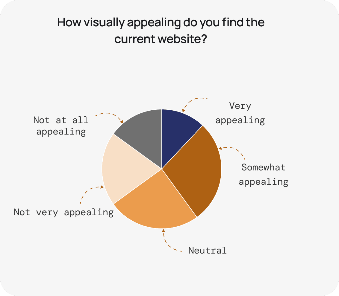
After analysing the UX issues on the Edukraft website, we conducted secondary research to gain a deeper understanding of the problems. Google Forms were used to gather feedback through warm-up surveys, identifying what works well on the current site and what needs improvement.


02
Primary research
Based on insights gained from user research, we conducted interviews with 6 prospective students, 2 alumni and 2 counsellors representing our potential target audience. During these interviews, we asked a series of open-ended questions to gather in-depth responses and valuable insights from the participants.
research methods
interviews, affinity mapping, user Persona, card sorting
sample size
6 prospective students, 2 alumni and 2 counsellors

03
Site Map
After completing the card sorting process, we successfully created a site map. This structured layout ultimately enables users to better understand their surroundings and easily find what they are looking for.

04
Style Guide
A grid system was set for the designs to keep the layout consistent. This helped organize content clearly and maintain a strong visual hierarchy. We chose Poppins as the brand's typeface for its modern, approachable style and readability. It reflects our brand's essence and commitment to user-friendly design. To meet our main goal of creating a cohesive color palette, we've chosen hues inspired by brand's logo, particularly blue and amber. The selected colors are ideal for a website assisting students interested in studying abroad; blue symbolizes trust and stability, while amber adds warmth and excitement. By strategically blending these colors, our aim is to craft an inviting platform that resonates with our audience, reinforcing our brand's presence.
Primary Colour

Secondary Colour

05
ideation methods
interviews, affinity mapping, user Persona
design iterations
6 low-fidelity concepts, 2 mid-fidelity concepts
design focus
Clarity, Trust, Simplicity

Proposed Design Solutions
Home Page
06


07


08


09


10


11
outcome
interviews, affinity mapping, user Persona, card sorting
Conclusion


.say hello